css
纯 CSS 实现十个还不错的 Loading 效果
4个好用的 CSS 伪类 not()、has()、 is()、where()
CSS 中的 Clamp 函数:掌握动态布局的秘籍
css特效:图片倒影
本文档使用 MrDoc 发布
-
+
首页
纯 CSS 实现十个还不错的 Loading 效果
> 作者:Jimmy,版权归原作者所有,如有侵权请及时联系 > > https://juejin.cn/post/7080542771387301896 在推特上面看到 ***\*T. Afif\**[1]** 介绍的十个 `Loading` 效果。如上图。 Yeah,很赞哦,挺实用的,遂记录下来。 为保证运行正常,咱先规定下: ```css * { box-sizing: border-box; } ``` ### 1. 平滑加载  ```css <div class="progress-1"></div> .progress-1 { width:120px; height:20px; background: linear-gradient(#000 0 0) 0/0% no-repeat #ddd; animation:p1 2s infinite linear; } @keyframes p1 { 100% {background-size:100%} } ``` 1. `linear-gradient(#000 0 0)` 你可以理解为 `linear-gradient(#000 0 100%)`,如果还不熟悉,复制 `linear-gradient(#000 0 50%, #f00 50% 0)` ,替换原先的部分跑一下。觉得 `linear-gradient(#000 0 0)` 别扭的话,直接写 `#000` 即可。 2. `0/0%` 是 `background-position: 0;/background-size: 0;` 的简写。 ### 2. 按步加载 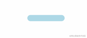 ```css <div class="progress-2"></div> .progress-2 { width:120px; height:20px; border-radius: 20px; background: linear-gradient(orange 0 0) 0/0% no-repeat lightblue; animation:p2 2s infinite steps(10); } @keyframes p2 { 100% {background-size:110%} } ``` 1. `steps(10)` 是 `step(10, end)` 的简写,指明刚开始没有,所以有**第2点**的处理 2. `100% {background-size:110%}` 添加多一个 `step` 的百分比,上面的 `step` 是 `10`,所以是`100% + (1/10)*100% = 110%` ### 3. 条纹加载  ```css <div class="progress-3"></div> .progress-3 { width:120px; height:20px; border-radius: 20px; background: repeating-linear-gradient(135deg,#f03355 0 10px,#ffa516 0 20px) 0/0% no-repeat, repeating-linear-gradient(135deg,#ddd 0 10px,#eee 0 20px) 0/100%; animation:p3 2s infinite; } @keyframes p3 { 100% {background-size:100%} } ``` `repeating-linear-gradient(135deg,#ddd 0 10px,#eee 0 20px) 0/100%;` 画出灰色的斑马线条纹,`repeating-linear-gradient(135deg,#f03355 0 10px,#ffa516 0 20px) 0/0% no-repeat` 则是进度条加载的条纹。ChatGPT中文网站:https://aigc.cxyquan.com ### 4. 虚线加载 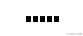 ```css <div class="progress-4"></div> .progress-4 { width:120px; height:20px; -webkit-mask:linear-gradient(90deg,#000 70%,#0000 0) 0/20%; background: linear-gradient(#000 0 0) 0/0% no-repeat #ddd; animation:p4 2s infinite steps(6); } @keyframes p4 { 100% {background-size:120%} } ``` `-webkit-mask` 默认有值 `repeat`,不然遮罩不会有五个。 ### 5. 电池加载 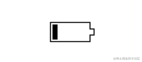 ```css <div class="progress-5"></div> .progress-5 { width:80px; height:40px; border:2px solid #000; padding:3px; background: repeating-linear-gradient(90deg,#000 0 10px,#0000 0 16px) 0/0% no-repeat content-box content-box; position: relative; animation:p5 2s infinite steps(6); } .progress-5::before { content:""; position: absolute; top: 50%; left:100%; transform: translateY(-50%); width:10px; height: 10px; border: 2px solid #000; } @keyframes p5 { 100% {background-size:120%} } ``` 原作者对 `.progress-5::before` 伪元素实现如下: ```css .progress-5::before { content:""; position: absolute; top:-2px; bottom:-2px; left:100%; width:10px; background: linear-gradient( #0000 calc(50% - 7px),#000 0 calc(50% - 5px), #0000 0 calc(50% + 5px),#000 0 calc(50% + 7px),#0000 0) left /100% 100%, linear-gradient(#000 calc(50% - 5px),#0000 0 calc(50% + 5px),#000 0) left /2px 100%, linear-gradient(#0000 calc(50% - 5px),#000 0 calc(50% + 5px),#0000 0) right/2px 100%; background-repeat:no-repeat; } ``` > \#0000 是透明,同等 transparent ### 6. 内嵌加载 这名字起得有些不贴切,不过不重要,读者看图自然理解。 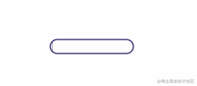 ```css <div class="progress-6"></div> .progress-6 { width:120px; height:22px; border-radius: 20px; color: #514b82; border:2px solid; position: relative; } .progress-6::before { content:""; position: absolute; margin:2px; inset:0 100% 0 0; border-radius: inherit; background: #514b82; animation:p6 2s infinite; } @keyframes p6 { 100% {inset:0} } ``` `inset:0 100% 0 0;` 右边内缩 `100%`,所以在 `keyframes` 部分需要将 `inset` 设置为 `0`。 ### 7. 珠链加载  ```css <div class="progress-7"></div> .progress-7 { width:120px; height:24px; -webkit-mask: radial-gradient(circle closest-side,#000 94%,#0000) 0 0/25% 100%, linear-gradient(#000 0 0) center/calc(100% - 12px) calc(100% - 12px) no-repeat; background: linear-gradient(#25b09b 0 0) 0/0% no-repeat #ddd; animation:p7 2s infinite linear; } @keyframes p7 { 100% {background-size:100%} } ``` 遮罩 `-webkit-mask` 中 `radial-gradient` 是将宽度四等份,每份以最小 `closest-side` 的边为直径画圆。微信搜索公众号:架构师指南,回复:架构师 领取资料 。 ### 8. 斑马线加载  ```css <div class="progress-8"></div> .progress-8 { width:60px; height:60px; border-radius: 50%; -webkit-mask:linear-gradient(0deg,#000 55%,#0000 0) bottom/100% 18.18%; background: linear-gradient(#f03355 0 0) bottom/100% 0% no-repeat #ddd; animation:p8 2s infinite steps(7); } @keyframes p8 { 100% {background-size:100% 115%} } ``` 对 `linear-gradient` 描绘的角度做调整,再加上蒙版。 ### 9. 水柱加载  ```css <div class="progress-9"></div> .progress-9 { --r1: 154%; --r2: 68.5%; width:60px; height:60px; border-radius: 50%; background: radial-gradient(var(--r1) var(--r2) at top ,#0000 79.5%,#269af2 80%) center left, radial-gradient(var(--r1) var(--r2) at bottom,#269af2 79.5%,#0000 80%) center center, radial-gradient(var(--r1) var(--r2) at top ,#0000 79.5%,#269af2 80%) center right, #ccc; background-size: 50.5% 220%; background-position: -100% 0%,0% 0%,100% 0%; background-repeat:no-repeat; animation:p9 2s infinite linear; } @keyframes p9 { 33% {background-position: 0% 33% ,100% 33% ,200% 33% } 66% {background-position: -100% 66%,0% 66% ,100% 66% } 100% {background-position: 0% 100%,100% 100%,200% 100%} } ``` `radial-gradient` 画出水平面的波动,就三个圆。`var(--r1)` 直接调用定义好的属性值。技能 `get` ... ### 10. 信号加载  ```css <div class="progress-10"></div> .progress-10 { width:120px; height:60px; border-radius:200px 200px 0 0; -webkit-mask:repeating-radial-gradient(farthest-side at bottom ,#0000 0,#000 1px 12%,#0000 calc(12% + 1px) 20%); background: radial-gradient(farthest-side at bottom,#514b82 0 95%,#0000 0) bottom/0% 0% no-repeat #ddd; animation:p10 2s infinite steps(6); } @keyframes p10 { 100% {background-size:120% 120%} } ``` 用 `repeating-radial-gradient` 方法画出环状的蒙版遮罩。`radial-gradient` 从底部向上圆形渐变填充。
admin
2024年7月2日 11:40
转发文档
收藏文档
上一篇
下一篇
手机扫码
复制链接
手机扫一扫转发分享
复制链接
Markdown文件
分享
链接
类型
密码
更新密码